BSC's Brand
BSC's Brand
All departments, offices, special programs and centers should consult with the Office of Communications before starting projects, including design, production, printing, art, photography, and online/video production. Working with Communications and adhering to visual standards help Birmingham-Southern achieve an effective, efficient, and cost-conscious communications program.
Note: For questions regarding BSC Athletics branding, contact the Athletics department at [email protected].
LOGOS
The wordmark is the face and signature of the brand. It connects the brand to all forms of communication. The more consistent a wordmark looks and is used, the more likely it will be remembered and make an impact. Each communication needs to be able to stand alone as a proper representation of the brand, but also gain strength as a cohesive, integrated collection of materials. These guidelines provide direction for how the BSC Wordmark should be used to help unify materials and continue to build the brand.
The wordmark is for use in all branding materials or communications from or about the college. Examples include letterhead, business cards, print ads, college collateral, admission documents, direct mail, television commercials, videos, websites and more. Guidelines for how to use this version have been established to maintain branding consistency. Departments, offices, special programs and centers within the college should not create any new logos. Please contact the Office of Communications at [email protected] to get approved versions of the wordmark. Note: The BSC logo, and not the seal, should be used as the identifying mark on all official college Facebook pages and other social media. For policies and guidelines for establishing Facebook pages for official college, office, or center use, please contact the Office of Communications at [email protected].
CONFIGURATIONS
The wordmark is available in several configurations to accommodate a wide range of applications. Each configuration should be treated as one unit. The proportion and spacing of the elements should not be altered in any way. Color, typography and reproduction specifications of the wordmark, as well as details about the communications materials on which it will appear, are provided here. The letters, ‘BSC,’ in the typeface shown, may be used alone in internal applications. The nameplate, in the typeface shown (Giovanni), may also be used alone. For configurations/color uses outside of the guidelines presented in this manual, please contact the Office of Communications at [email protected].
SECONDARY SIGNATURES
These versions of the wordmark signature have been developed for use by departments, offices, special programs and centers. By adding the unit name, the unit name receives prominence while retaining an overall BSC identity. Secondary signatures are not to be used on major publication covers, stationery or business cards. Secondary signatures shall be used with only the left-justified configuration of the wordmark, as shown. The Office of Communications will be responsible for generating original department, office, special program and college center signatures. Your department/office/program/ center signature is available from the Office of Communications. Please contact the Office of Communications at [email protected] to have one created. No new logos may be developed unless approved and created through the Office of Communications.
FORMATS
Clear Space Requirements
To be visually effective, the BSC wordmark requires an open area around it. This area is called the ‘control area.’ It is defined as the border (margin) of empty space around the logo, equal to a minimum of 1/4 of an inch. The greater the clear space, the better.
It is preferable that no other visual elements appear within the control area. maintain a minimum distance of 1/4 inch between the wordmark and any other elements appearing with it.
Please maintain 1/4 inch of space around all other treatments of the wordmark (left-justified, stacked, and lone elements).
Proportion
The ‘BSC’ letters and spelled-out name should always be kept in the proportions shown to maintain the integrity of the logo. Always use the approved wordmark files and use only vector files of the wordmark when printing. Never try to recreate the wordmark yourself. If you need to scale the wordmark, always constrain proportions so the height and width are scaled simultaneously. To maintain the correct proportions of the wordmark, always hold down the shift key as you drag the corner to increase or decrease its size.
Size
The wordmark should not appear smaller than 1 3/8“ wide in any printed material or 100 pixels wide on-screen.
PLACEMENT
For all BSC communications, the BSC wordmark should be placed in either 1) the lower-right corner at a minimum of 1/2” from the edges of the page, or 2) the lower center at a minimum of 1/2” from the edges of the page. The wordmark should never be placed against the edge of the page as a bleed because when the page is trimmed, the wordmark is often cropped disproportionately, violating the visual identity standards. The wordmark should always appear on the outside front cover of any piece of communication. Please contact the Office of Communications for permission to place the wordmark in a location other than those outlined above. The recommended positions should pose no problems for general collateral creation.
INCORRECT PLACEMENT
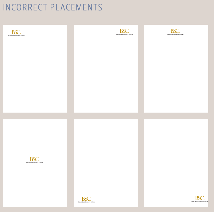
Do not place the wordmark anywhere other than the lower-right corner or lower center of a page with the 1/2” buffer from the edge of the page. Do not bleed the wordmark off the edges of a page. Do not use a wordmark format that does not conform to the guidelines. In a color application, the approved gold and black wordmarks should always be used. The Office of Communications reserves discretion to place the wordmark as needed for optimal design. For placements outside of the guidelines presented, please contact the Office of Communications.
THE COLLEGE SEAL
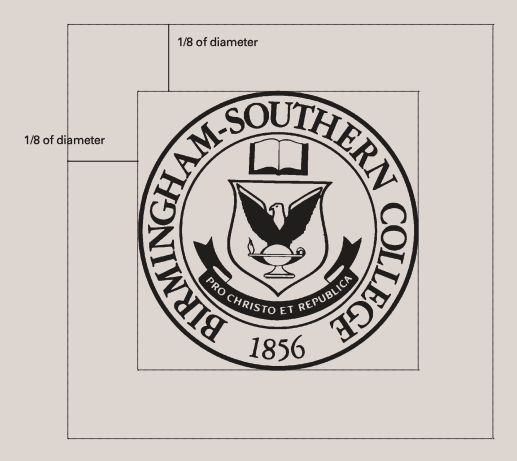 The Birmingham-Southern College seal should be used for only the most formal of applications, such as building plaques, grade reports/transcripts and diplomas. In rare cases where it is appropriate to apply the seal, other information, such as the wordmark, other logos, photos, graphics, headlines, or text, shouldn’t be placed within the protected area of the seal. The protected area includes a distance equivalent to 1/8 (12.5%) of the diameter of the seal. Again, in rare cases where it is appropriate to apply the seal, it may 1) overprint photos or textured backgrounds, or 2) be reversed out of photos, textured backgrounds, and dark backgrounds—as long as the background doesn’t compete with the seal. Please direct all questions regarding appropriate use of the seal to the Communications Office.
TYPEFACES
Primary Body Text: Woodford Bourne Regular
Headings: Woodford Bourne Bold
Archer
COLORS
Colleges understand the importance of color in creating pride and unity. The power of Birmingham-Southern’s gold and black is obvious at every ceremonial and sporting event. Color can be just as powerful in other forms of communication as well. When used consistently, colors help make a brand more cohesive and recognizable. Colors can become as identifiable as the logo or the name, but only if they are used consistently and correctly.
Primary Color Palette
Black, gold and white comprise the primary color palette. They should be the dominant colors used when designing all print materials. PMS and CMYK codes are provided to allow for exact matching.
|
Gold C0 M24 Y100 K0; R239, G194, B49; #efc231 |
Black C0, M0, Y0, K100; R0, G0, B0 #000000 |


Secondary Color Palette
The secondary color palette includes a range of tones that complement the primary colors without overpowering them. The secondary palette includes a range of colors that function as accent colors and should never overtake the design. They should always be used with the primary gold and not alone. Use at least two of the secondary colors with the gold; avoid pairing gold and red or gold and lime green.
|
Navy C90 M83 Y40 K29; R54, G57, B90; #36395a |
Orange C0 M53 Y100 K1; R219, G138, B46; #db8a2e |
Aqua C80 M10 Y45 K0; R91, G167, B157; #5ba79d |
Red C7 M100 Y100 k0; R192, G37, B43; #c0252b |
|
Teal C100 M6 Y29 K28; R0, G126, B141; #007e8d |
Lime C48 M4 Y100 K0; R147, G193, B62; #93C13E |
Grass C85 M10 Y100 K10; R81, G147, B76; #51934c |


STATIONARY SHIPPING
A cohesive stationery system includes letterhead, envelopes and business cards. In many cases, these materials are the first impression made with constituent audiences, so they must present a unified look. They are a key component to the brand and offer an easy way to maintain consistency across the college community.
LETTERHEAD
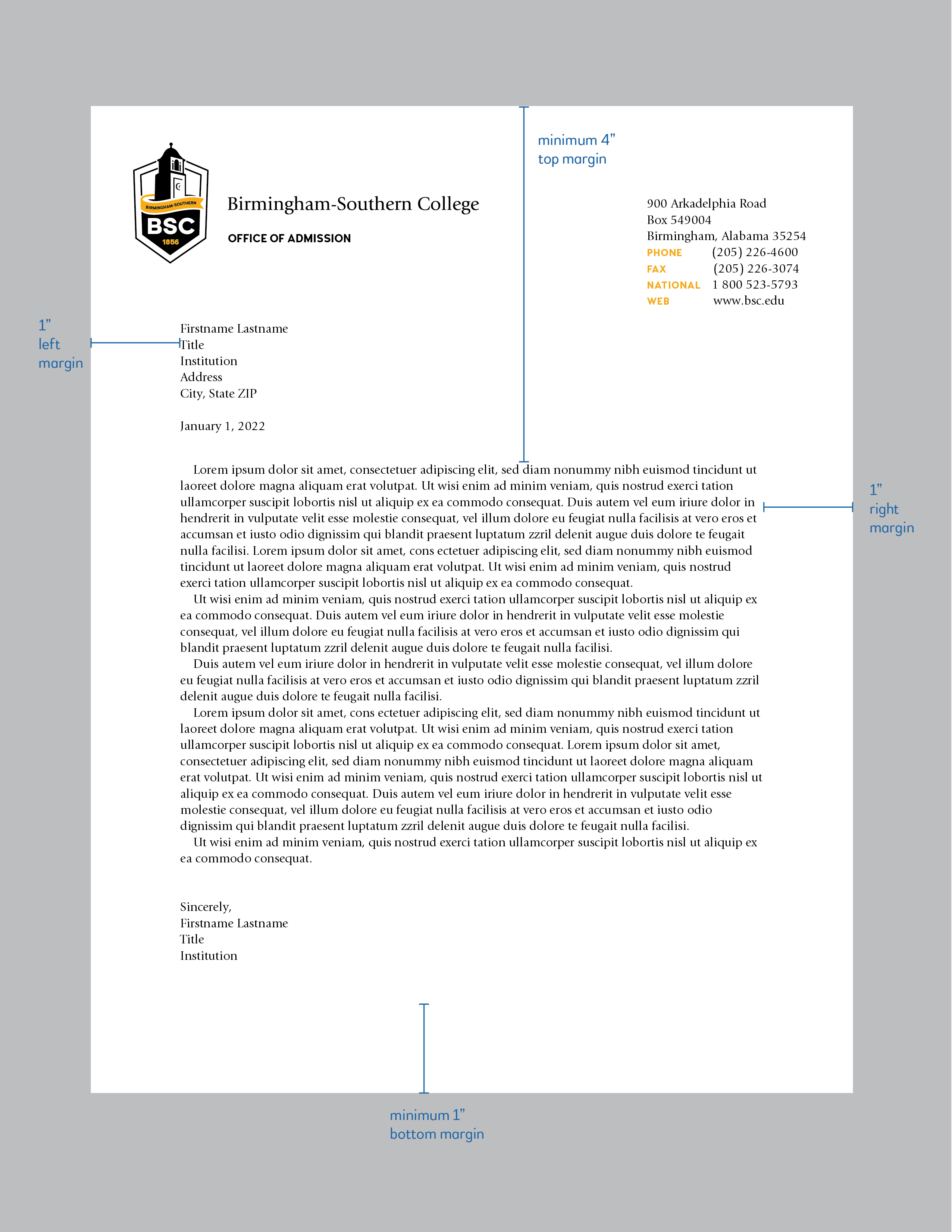
The letterhead design is standardized to promote consistency; yet it also offers a way for departments, offices, programs and/or centers to include their specific contact information within the design. The left margin should measure 1” from the recipient's name/title information. The right margin should likewise measure 1”. The top margin will vary according to the amount of text printed in the address section of the letterhead (as many as five lines of text, as shown). However, we recommend that the body of the letter begin at no less than 3” from the top of the page. The last line of the letter should measure a minimum of 1” from the bottom of the page. NOTE: sample is shown at a reduced size/scale. All letterhead orders must be printed by Panther Print and Post.
ENVELOPES
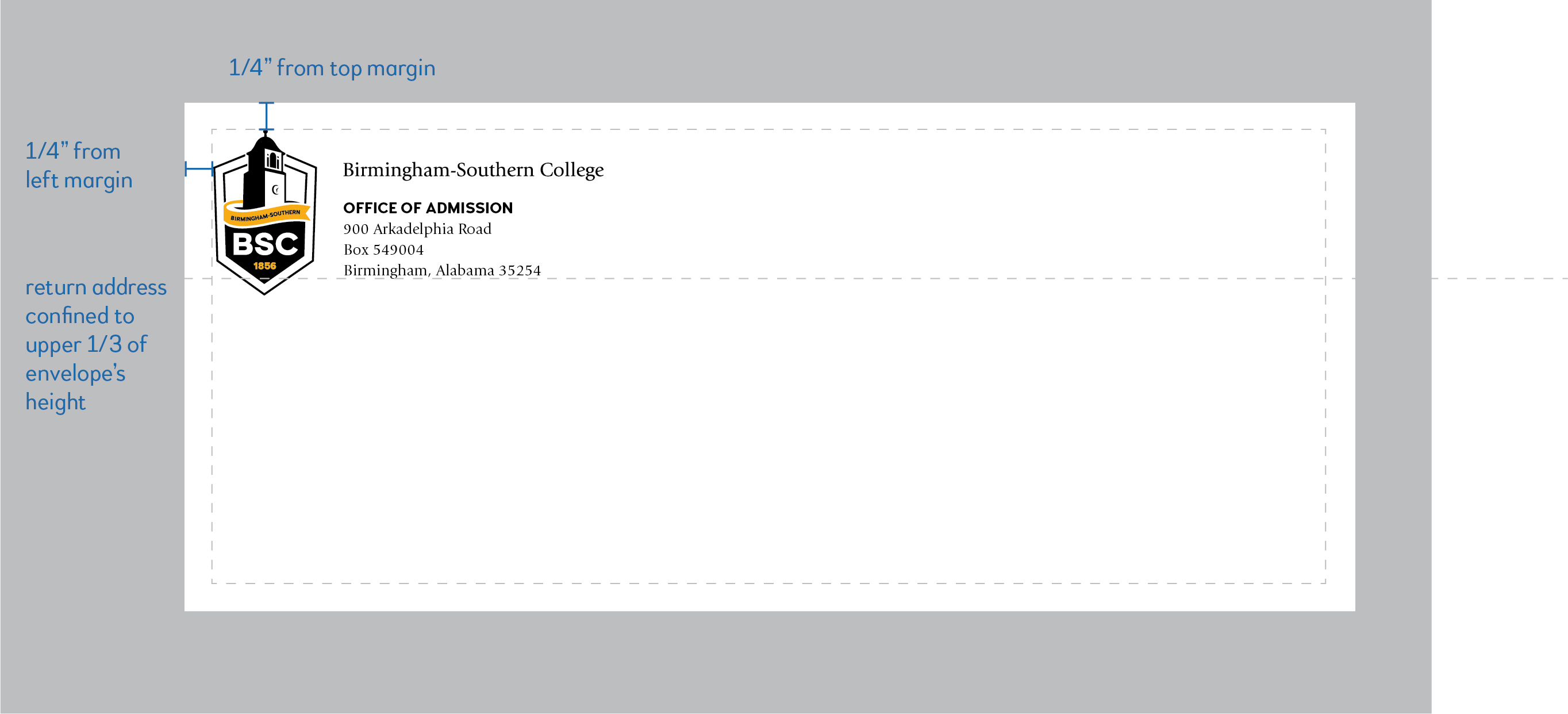
In compliance with postal regulations/scanning equipment tolerances, the return address and graphic for an envelope cannot exceed more than 1/3 of the upper portion of the envelope’s height (USPS regulations). The return address should begin at a minimum of 1/4” from the top and left margins of the envelope. NOTE: #10 envelope sample is shown to scale. All envelope orders must be printed by Panther Print and Post.
BUSINESS CARDS
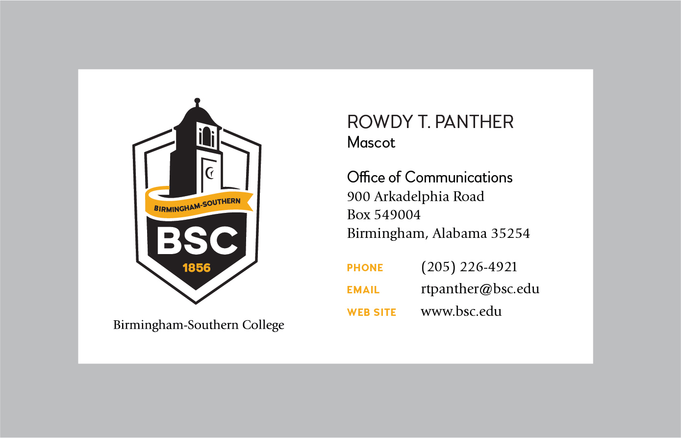 One design is available for BSC’s institutional business cards for faculty and staff (Note: Athletics staff may request business cards with the Athletics logo). The card can include up to ten lines of holder-specific information. The back of the card should be left blank. All institutional business cards must conform to this format and may not carry unit-specific logos. All business cards must be printed by the Panther Print and Post. If you have questions about the official BSC business cards, or if you have special business card needs, please contact the Office of Communications.
Powerpoint Templates
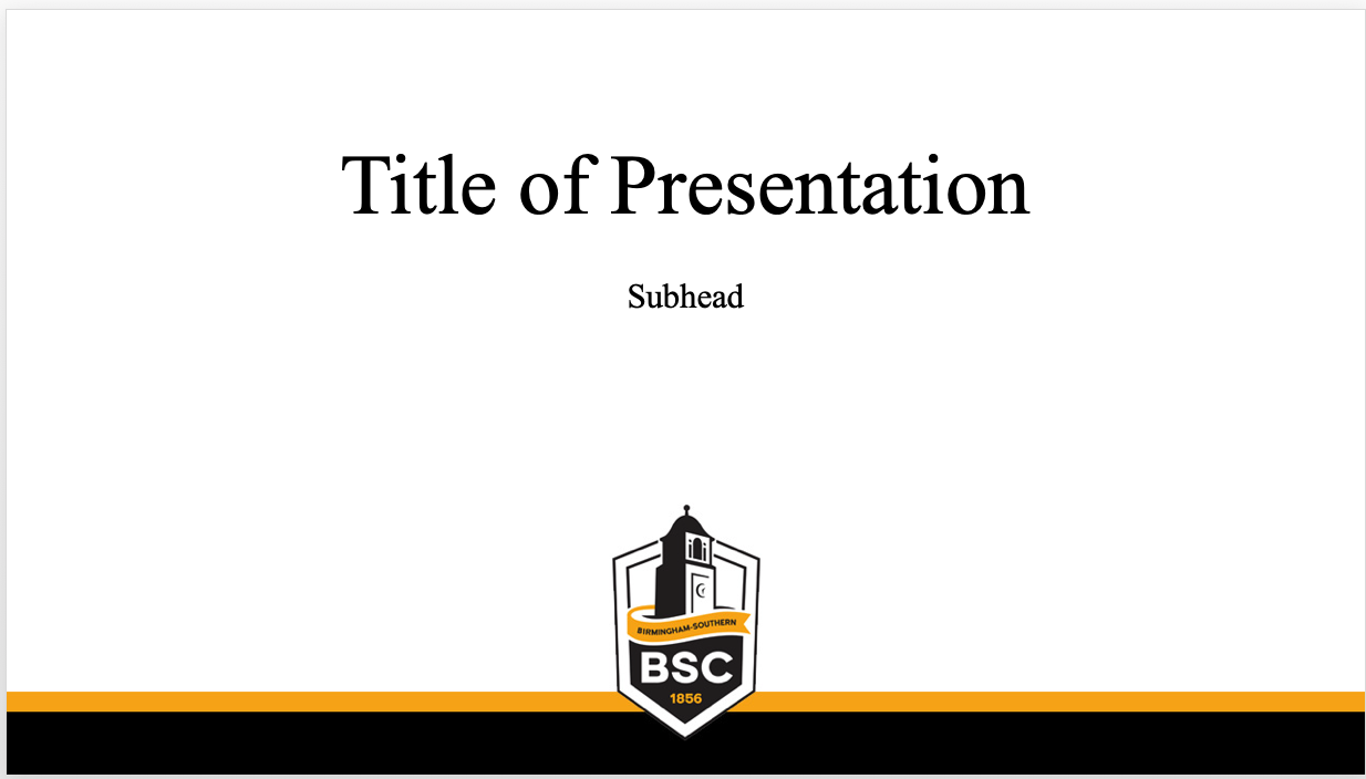
BSC maintains a Powerpoint template for use on official presentations.